Typography
-How I did my idea
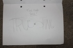
The idea I went for was “trusting” I decided to go for trusting because when asking people that knew me well had this feeling or emotion they felt represented me. When looking into other types of typography I looked at the top pieces and what made them so good. When deconstructing the images seen on this incredibly inspiring website: http://www.designyourway.net/blog/inspiration/41-examples-of-impressive-3d-typography/ it showed me that not all designs have to be packed full of graphics. I wanted to have a nice basic design so that my typography would express its self with out confusing my audience. I did my typography in illustrator I made It by using a mixture of masks and text to create my design.
-Research into other typography
I looked in to other typography on several website:
http://www.designyourway.net/blog/inspiration/41-examples-of-impressive-3d-typography/
http://idesignow.com/illustrator/20-best-illustrator-typography-tutorials.html
I looked at these websites to increase my knowledge of typography I researched all different types of ideas so that I could get the best out of my project.
-Ideas
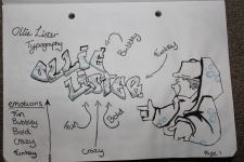
My main Idea was to do trusting I had images in my head of how I was going to portray trusting. I wanted to use the s in trusting to link half the word to the other half and have a bond. I used the S to link the to words to convey trust.
-Sketches – Uploaded.
-Colour schemes/palette
I used the blue colours because in the colour wheel it shows that blue is the colour for trust so I used the blue palette to convey my feeling. I wanted to try and show my design with out clashing the colours. I believe that it shows my feeling well in illustrator.
– What makes good typography?
This website shows me the good tips and tricks to making good typography:
http://blog.themeforest.net/resources/10-typography-tips-for-web-designers/
– How to grasp your audience
This article explains how to make the basics of composition and how to make an eye-catching design. This article is not just for photo manipulation but I think it goes well with typography or any graphical submission.