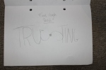
This was my final design:
Monthly Archives: December 2011
Poster Inspiration
I looked around to find different inspirational idea I looked at the Nazi propaganda and pick up a few good ideas to add to my piece then I planned to look for some main inspiration from the current typographers I looked at all different types of aesthetic designs. These where my favourite for my idea:


1st Idea For Typographic Poster

this was my fist design i hadn’t finished colouring it i wanted it to be more symmetrical so the eye could read it better so i changed a few things on my poster. i changed the should on both lines so that it was more in keeping with my design and i wanted the poster to only have a few colours so it didn’t clash.
Deciding On My Quote.
The Quote I have chosen was by David Craib the quote was “Design should never say, ‘Look at me.’ It should always say, ‘Look at this.’” I felt this quote was best for my design because it sent a lot of design ideas running through my mind and I instantly came up with a few ideas. This quote was quoted in the book 401 Design Meditations: Wisdom, Insights, and Intriguing Thoughts from 150 Leading Designers by Catharine Fishel.
I wanted this quote because I felt it was a very punctual quote and it was very sharp. As a designer I’m all about beautiful designs I like my designs to be punchy, elegant and eye catching I like people to see my designs and think “Yes I can see why you have done that” I like to get people into my work and I always try and make my designs connect with my audience.
Poster Research
Research:
I looked into Nazi propaganda and the way they were designed. I found the nazi propaganda more interesting because it had a lot of repartition this was something I liked and I added to my poster I had certain words in the same typeface so that it had added emphasis.
The man in charge of the Nazi propaganda was a man called Joseph Goebbels. When Adolf Hitler became chancellor in January 1933, he appointed Goebbels as Minister for Public Enlightenment and Propaganda. This meant he had a lot of power over the German people. Hitler and Goebbels knew how powerful propaganda was and used it to heighten Hitler’s campaign.
Some inspiring examples of Joseph Goebbels work was:


Despite the fact that there is imagery when I was looking at these pieces I was looking at the colour palette and the similarities though out the work. When looking at the work I found that the most effective pieces of propaganda were the ones designed with aesthetics in mind. Also looking at these colours there were all very matted colours I liked these colours because I think it had a nice effect on the poster.
Other places I looked was at these 30 outstanding designs http://spyrestudios.com/outstanding-typographic-posters/
This was very interesting to look at because it had some amazing ideas I was looking at the colours, typeface, spacing, positioning and the layout of the page.
I took the ideas from this and tried to make my design have that same feel thinking over my design I believe I could design a much better one using Photoshop in addition with illistrator.
A3 Quotation Poster
Why I Have Decided To Go With My Idea.
I have decided to make the A3 poster with my chosen typographic style because i believe it has the most eye catching delivery. For my quote i wanted to make sure that my quote was represented in my typography.
–Colour scheme.
For my poster I looked into several different types of typography styled posters I looked into propaganda designed for the Nazi’s I found this type of typography most helpful towards my piece because they used matt colours nothing to sharp or vibrant. I used this colour scheme in my poster to try and replicate the design style of old propaganda. I have decided to go with these colours because i think this is what goes best on my poster.
–
Typography
Typography
-How I did my idea
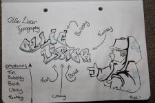
The idea I went for was “trusting” I decided to go for trusting because when asking people that knew me well had this feeling or emotion they felt represented me. When looking into other types of typography I looked at the top pieces and what made them so good. When deconstructing the images seen on this incredibly inspiring website: http://www.designyourway.net/blog/inspiration/41-examples-of-impressive-3d-typography/ it showed me that not all designs have to be packed full of graphics. I wanted to have a nice basic design so that my typography would express its self with out confusing my audience. I did my typography in illustrator I made It by using a mixture of masks and text to create my design.
-Research into other typography
I looked in to other typography on several website:
http://www.designyourway.net/blog/inspiration/41-examples-of-impressive-3d-typography/
http://idesignow.com/illustrator/20-best-illustrator-typography-tutorials.html
I looked at these websites to increase my knowledge of typography I researched all different types of ideas so that I could get the best out of my project.
-Ideas
My main Idea was to do trusting I had images in my head of how I was going to portray trusting. I wanted to use the s in trusting to link half the word to the other half and have a bond. I used the S to link the to words to convey trust.
-Sketches – Uploaded.
-Colour schemes/palette
I used the blue colours because in the colour wheel it shows that blue is the colour for trust so I used the blue palette to convey my feeling. I wanted to try and show my design with out clashing the colours. I believe that it shows my feeling well in illustrator.
– What makes good typography?
This website shows me the good tips and tricks to making good typography:
http://blog.themeforest.net/resources/10-typography-tips-for-web-designers/
– How to grasp your audience
This article explains how to make the basics of composition and how to make an eye-catching design. This article is not just for photo manipulation but I think it goes well with typography or any graphical submission.
Typography Sketches


Choosing my feeling/emotion
I thought the best way to get an emotion or feeling that represented me best was to ask toughs closest to me I asked them because I may view my self different to others so I did some research and asked my family and house mates what feelings and emotions come to mind when you look at me and the results are below. I went with trusting as people that know me well say I’m a truthful and honest guy. I liked the idea of trusting because I believed that I could make a good typographic design and that it would link nicely to my personality.
| Dad: | EnthusiasticConsiderate
Trusting Motivated Sociable Positive |
| Mum: | CaringSensitive
Trustworthy |
| Brother: | Easy goingFriendly |
| Grandmother: | Charming |
| Grandfather: | Outgoingpersonable |
Group work and research
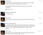
This is our group work through these pictures you can see how we managed to get all our work done as a group and all pull our wait evenly. We designated roles to each other to share the workload.
Working in a group was a good experience to have working in a group can be hard at times but I believe working in a group helped my communication skills a lot we had to do conduct team meetings and talk about the work so that we produced a quality presentation.
We each did 4 pieces of work towards our presentation talking about
-Who we are (Done) AL
-Logo (Done) AL
-The Brief Rewrite (Done) OL
-Brief Bullet points (Done) OL
-Ideas (Done) OL
-Research (Done) OL
-The Current Situation In horizons. (NEEDS TO BE DONE) AO
-What we are going to do (Done) AL
-What we need (Done) AL
-Website write-up ………………… (NEEDS TO BE DONE) AO
-How are Voting works () AO
-Prize (Done) AL
-Final Image, website (Done) AO
I posted this on our forum so that everyone knew what we were doing and there was no confusion. I believe that over all it went every well. We did a lot of research in to different web site that we found were help full to our project.
We are going to hopefully present this as a flowing presentation to the client so they fully understand the ideas that AOA Graphics has to offer them.
Below you can see the photos of how we conducted our team work: